Designing a menu for a food truck is an exercise in extreme limitation. Operators must contend with severe spatial constraints, unpredictable weather conditions, and the necessity of capturing the attention of passing foot traffic from a distance. Unlike a seated restaurant where a guest has time to peruse, a food truck menu must communicate its entire value proposition in a matter of seconds.
The Ten-Foot Rule
The most critical metric for a food truck menu is legibility from a distance. Potential customers often assess the menu from the back of the queue or while walking past. If the text is too small, they will keep walking. This necessitates the "Ten-Foot Rule"—the core offerings and their prices must be easily readable from ten feet away.
To achieve this, typography must be robust. Heavy, condensed sans-serif fonts are ideal because they allow for larger text sizes without horizontal sprawling. High contrast is non-negotiable; black text on a white or bright yellow background, or stark white text on a dark background, ensures readability even in harsh, direct sunlight.
Ruthless Curation
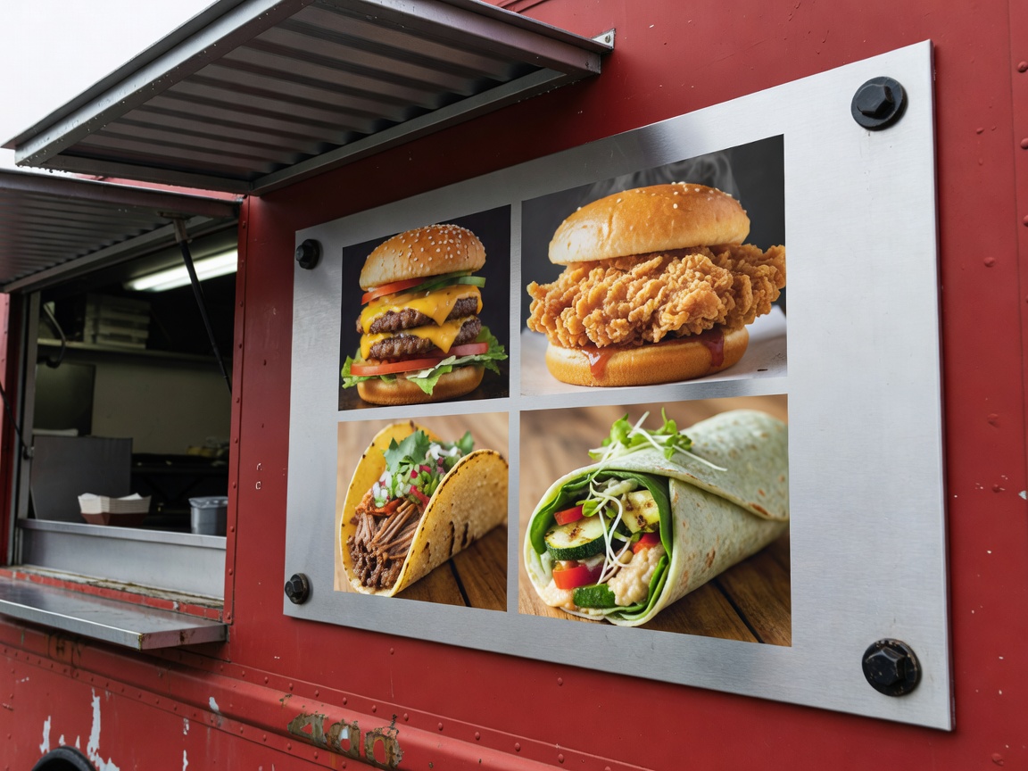
Space is at a premium, both on the truck's exterior and within its tiny kitchen. A food truck menu cannot be a sprawling list of options. It requires ruthless curation. The most successful food trucks offer three to five core items, perhaps with a few simple variations or side dishes. This limited scope not only fits comfortably on a small exterior panel but also guarantees rapid kitchen execution.
Visual hierarchy is essential here. The eye naturally travels to the center of the panel. Operators should place their highest-margin, most popular signature item dead center, often boxed or highlighted with a bright accent color, leaving secondary sides and beverages to the lower periphery.
Material Durability
Food trucks battle the elements daily. Rain, wind, grease, and exhaust fumes quickly degrade standard signage. Paper and untreated cardboard are entirely useless. Menus must be constructed from highly durable materials:
- Coroplast (Corrugated Plastic): Cheap, lightweight, and waterproof. Great for temporary or seasonal menus.
- Dibond (Aluminium Composite): Extremely durable, rigid, and resistant to bending and wind damage.
- Laminated Magnetic Panels: Excellent for trucks made of steel, allowing operators to easily swap out items or "sold out" badges without tape or screws.
QR Codes and Full Disclosures
Because physical space dictates brief, punchy descriptions, there is often no room to list every single ingredient, which can be problematic for customers with severe allergies. The modern solution is the integration of a prominent, scannable QR code placed near the ordering window.
This code directs the customer to a mobile-optimized webpage detailing comprehensive allergy matrices, vegan cross-contamination policies, and the truck's upcoming location schedule. This offloads the dense, regulatory information to the digital realm, keeping the physical menu board clean and conversion-focused.
Conclusion
Food truck menus are essentially billboards crossed with retail catalogues. They demand a utilitarian approach to design: big fonts, brief copy, high contrast, and indestructible materials. By leaning into these constraints rather than fighting them, mobile operators can create a focal point that draws crowds and churns lines with maximum efficiency.