The fast casual dining segment is built entirely around speed, customisation, and volume. When guests order at a counter, the menu is not a leisurely read; it is a critical piece of operational infrastructure. If the menu design is confusing, the queue halts, throughput plummets, and revenue is lost. Consequently, fast casual menus must prioritise radical clarity and information hierarchy above all else.
The Dominance of Digital Displays
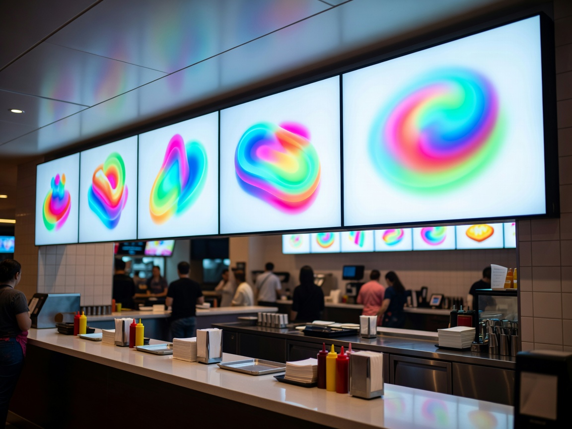
Unlike sit-down establishments, fast casual relies heavily on overhead digital boards. These screens must be legible from 10 to 15 feet away. This necessitates large, high-contrast typography—almost exclusively sans-serif fonts—and a rigorous adherence to grid layouts. Dark backgrounds with bright white text, or vice versa, are standard to cut through the ambient glare of a brightly lit restaurant.
Digital boards also offer a distinct operational advantage: dynamic dayparting. A well-configured digital menu automatically switches from breakfast offerings to lunch service at exactly 10:30 AM, removing the clutter of unavailable items and preventing customer disappointment.
Visualising the Customer Journey
Fast casual menus often feature customisable formats, such as building a bowl, a wrap, or a salad. The design must visually walk the customer through this process step-by-step. Numbered sections are a highly effective mechanism here:
- Step 1: Choose your base (Rice, Greens, Quinoa)
- Step 2: Select your protein (Chicken, Tofu, Steak)
- Step 3: Add toppings and sauces
By breaking the menu down into a linear progression, the design mirrors the physical movement of the customer along the assembly line. This pre-educates the diner while they wait in the queue, ensuring they are ready to order the moment they reach the staff member.
Photography and Visual Anchoring
While fine dining shuns food photography, fast casual embraces it. However, it must be deployed strategically. Rather than photographing every single item, which creates visual noise, operators should use high-quality imagery only for signature items or high-margin combos. These images act as visual anchors, drawing the eye immediately to the most profitable areas of the board.
There is a strong psychological component to this layout. The "anchor" item is frequently the most expensive, placed prominently on the left or top-centre. This establishes a high price anchor; when the customer's eye subsequently scans down to standard items, they appear reasonably priced by comparison.
Combo Meals and Frictionless Upselling
The ultimate goal of a fast casual menu is to increase the average transaction value without slowing down the line. This is where combo meals excel. By grouping a main item, a side, and a beverage under a single, easily communicable number or name (e.g., "The Classic Combo"), the cognitive load on the customer is drastically reduced. It is much faster to say "I'll have a Number 2" than to order each component individually.
Upselling must also be built into the menu architecture. Small callout boxes suggesting "Make it a meal for £3" or "Add extra avocado for £1" need to be positioned precisely where the eye naturally rests after selecting a main dish.
Conclusion
In the fast casual space, a menu is a tool for traffic management. Success hinges on stripping away excess information, enforcing a strict visual hierarchy, and leading the customer intuitively through the ordering process. When executed correctly, the design practically takes the order itself, leaving staff free to focus on rapid, accurate execution.