In the realm of fine dining, the menu is far more than a simple list of dishes and prices. It functions as an overture to the culinary performance that is about to follow. It sets expectations, establishes the restaurant's narrative, and physically embodies the brand's commitment to quality. Designing a fine dining menu requires an acute understanding of minimalism, typography, and material tactility.
The Psychology of Luxury
High-end establishments operate on a completely different psychological wavelength compared to casual restaurants. The primary goal is not to convey value or speed, but rather exclusivity, craftsmanship, and provenance. To achieve this, fine dining menus frequently utilise vast amounts of negative space. By allowing text to breathe on the page, the restaurant signals confidence; there is no need to cram the page with up-selling tactics or starbursts highlighting specials.
Furthermore, language shifts away from hyperbolic adjectives. You rarely see words like "delicious," "mouth-watering," or "huge" on a Michelin-calibre menu. Instead, the focus rests squarely on provenance and technique. A dish is not "tasty roasted chicken"; it is "Heritage breed poulet, wild garlic, fermented morel, vin jaune." The ingredients are presented as a statement of fact, allowing the reputation of the kitchen to promise the quality.
Typography and Layout
Editorial design principles are paramount in luxury menu design. Establishments generally favour classic serif typefaces—such as Garamond, Baskerville, or custom-drawn didones—to convey heritage and sophistication. These are often paired with a clean, geometric sans-serif for secondary information or pricing. The contrast creates a visual hierarchy that is both highly readable and aesthetically rigorous.
In terms of structure, fine dining menus are often divided into strict, traditional courses: *Hors d'oeuvres*, *Entrées*, *Plats Principaux*, and *Desserts*. Alternatively, a tasting menu format might abandon categories entirely, simply listing the progression of core ingredients down the centre of the page. This central alignment forces a deliberate, slow reading pace, echoing the measured pacing of the meal itself.
Pricing Strategies
The handling of prices on a luxury menu is famously delicate. The overarching objective is to decouple the diner's experience from the pain of payment. To this end, currency symbols are almost universally omitted. A price is simply listed as "45" rather than "£45.00" or "$45."
Additionally, prices are frequently tucked at the end of the dish description in the same font size and weight, rather than being right-aligned with a trailing dotted line. The dotted line draws the eye directly to the cost, encouraging price-shopping. By burying the price, the diner is forced to read the description first, falling in love with the culinary concept before considering the financial implication.
Materiality and Presentation
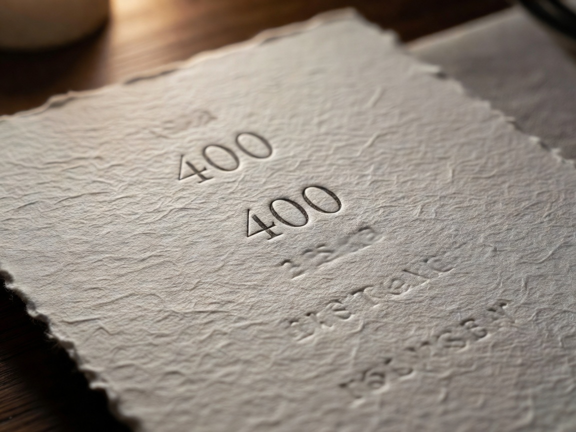
Digital menus via QR codes may have gained ground out of necessity, but in true fine dining, physical tactility remains unmatched. The weight of the paper—often a heavy cotton rag or a textured laid stock—communicates substance and permanence. Blind debossing, foil stamping, or bespoke leather bindings are commonly employed to elevate the physical object.
Because these menus often change daily based on market availability, many restaurants employ a hybrid approach: a heavy, permanent leather or wooden folio that holds a freshly laser-printed sheet of high-quality paper, signed and dated by the executive chef. This marriage of permanent luxury and daily immediacy perfectly encapsulates the fine dining ethos.
Conclusion
Crafting a menu for a high-end restaurant is an exercise in restraint. Every element—from the spacing between letters to the texture of the paper—must be intentionally chosen to reflect the precise, uncompromising nature of the kitchen. By focusing on minimalism, refined typography, and tactile materials, restaurateurs can ensure their menu serves as the perfect prologue to an unforgettable dining experience.